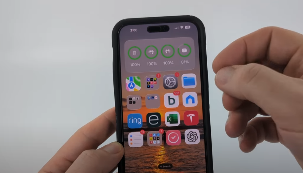
The controversy surrounding Apple’s Liquid Glass design in iOS 26 is remarkably similar to the reaction to the translucent menus in iOS 7. Some people find the effect to be futuristic, giving screens a glossy sheen. Others find it especially intrusive, as the blurred layers make it difficult to read the text and give them headaches. Users are forced to adapt—or rebel—because the look is enforced without a clear way to go back, much like a daring runway collection.
Table: Liquid Glass in iOS 26
| Feature | Details |
|---|---|
| Name | Liquid Glass (Apple design effect) |
| Introduced In | iOS 26 |
| Purpose | Creates a translucent, glossy, layered interface resembling frosted glass |
| Impact | Increased visual depth, but criticized for eye strain and accessibility issues |
| Device Compatibility | iPhone 11 and later, iPad Pro, MacOS Tahoe |
| Toggle Option | No direct off switch, only partial reduction via settings |
| Workarounds | Settings > Accessibility > Display & Text Size > Reduce Transparency; Increase Contrast; Reduce White Point |
| User Reactions | Mixed: praised for futuristic look, criticized for headaches, battery impact, readability |
| Comparable Features | Similar to iOS 7 transparency, macOS Big Sur frosted design |
| Official Support | Apple Support Community |

Complaints are flooding Reddit threads and Apple forums. Some astigmatic users claim the design makes their devices feel slow, while others call it visually punishing. Despite being remarkably successful at garnering attention, the feature has also incited resentment by being compared to antiquated Android skins. Creators like Marques Brownlee point out the new interface’s mixed reception, while tech commentators like Joanna Stern show it off with cautious approval.
Apple’s decision to omit an off switch is a continuation of a decades-old strategy in which the company dictates design with the power of a fashion house. Despite being incredibly effective at bringing devices together across iPhone, iPad, and Mac, this approach ignores accessibility issues. Accessibility settings, however, allow users to drastically lessen the impact. While “Increase Contrast” enhances clarity, “Reduce Transparency” fills menus with darker overlays. Brightness can be softened by adjusting the “Reduce White Point,” which significantly improves comfort for sensitive eyes.
These temporary solutions have been welcomed by the community. With incredibly clear visuals, YouTube tutorials guide users through the process, frequently suggesting darker wallpapers to further blur the effect. The glass is still slightly visible, but the shimmer is much diminished—like turning down the lights in a theater instead of turning them off. This change feels like a frustrating compromise to some, while it is sufficient for others to restore usability.
Accessibility and culture are discussed in more detail. In her remarks regarding light sensitivity, Billie Eilish made a startling analogy to the effects of Liquid Glass on migraine sufferers. Elon Musk used to mock overly complex car dashboards, claiming that simplicity always wins out. The question of whether visual innovation should take precedence over physical comfort or whether inclusivity should guide design is brought up by Apple’s decision to rely on maximalist gloss.
Apple has survived these storms over the last ten years. Every major design change, such as the notch on the iPhone X or the frosted menus in macOS Big Sur, has initially caused outrage before becoming accepted. The business frequently converts criticism into grudging acceptance through strategic persistence. Concerns about accessibility, however, are given different weight. Dizziness and migraines cannot be written off as aesthetic preferences, in contrast to stylistic objections. The demand for a real toggle is already being emphasized by advocacy organizations.
Liquid Glass supports Apple’s cohesive economic strategy. For visual coherence, Apple quietly entices users to upgrade their hardware by unifying iOS and macOS under a single design concept. The brand benefits greatly from this cohesion, which creates a seamless, contemporary ecosystem. However, for society, it highlights a conflict between innovation and user autonomy, reiterating discussions about algorithmic feeds, subscription models, and fashion cycles that establish taste without allowing for disagreement.
The popularity of Liquid Glass tutorials on TikTok and YouTube serves as an example of how fast grassroots communities can change. From lowering motion to using dark wallpapers, creators show how to make the effect bearable. These communities, which are incredibly adaptable, serve as both critics and problem-solvers, addressing any gaps that Apple may overlook. Their function demonstrates how digital design now provokes cultural discussion in ways that were previously only possible in fashion or film.
Apple has a decision to make in the future. In future updates, it might subtly add a toggle under the guise of inclusivity if user pressure increases. That change would be especially novel, representing one of the few times accessibility overrides design dominance. However, Apple might remain steadfast, believing that opposition will subside. Both outcomes are possible, according to the company’s history.

